Schott Pharma
Redesign Simplicity: SCHOTT Pharma App 3.0
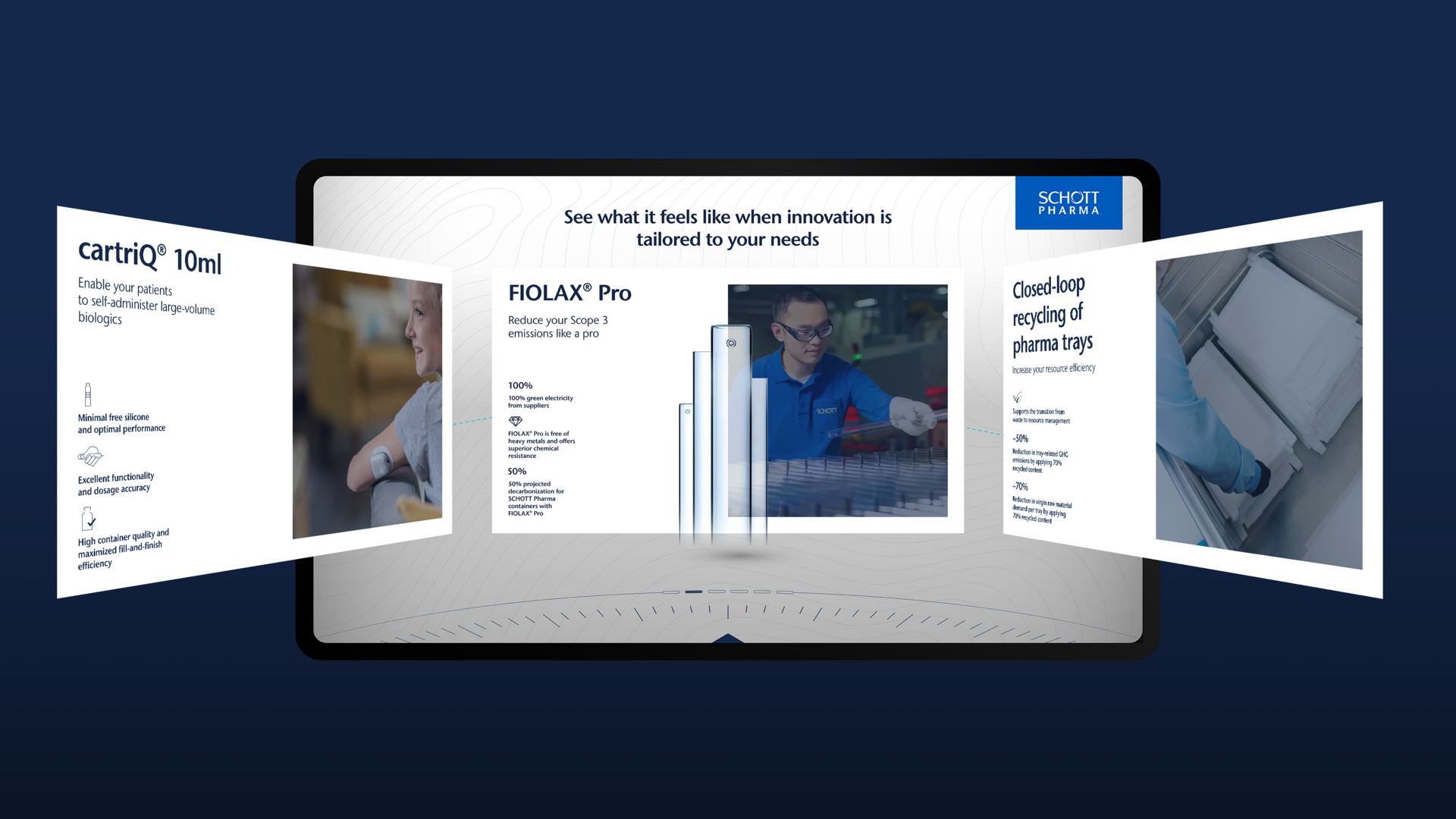
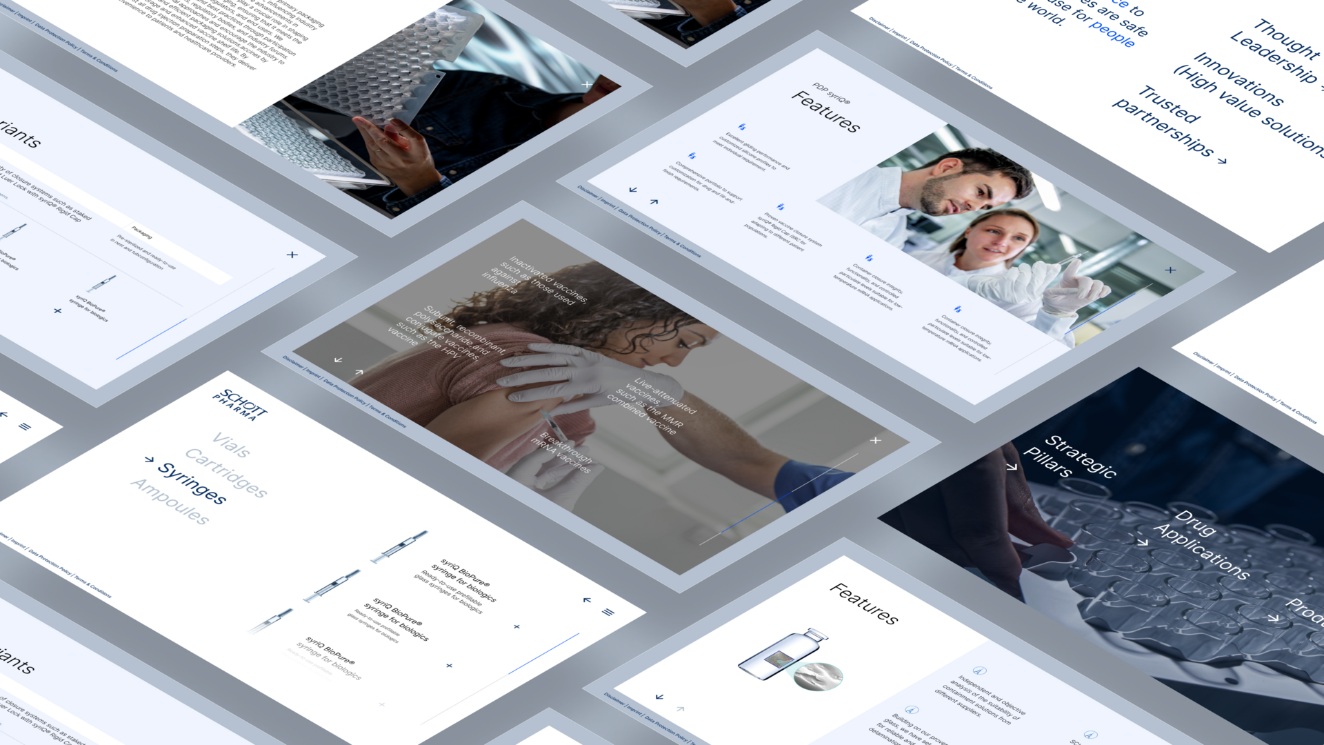
Less content, more clarity
When information overload started holding the experience back, we helped SCHOTT rethink their app—focusing on curiosity, clarity, and effortless navigation
A Shift Toward User-Friendly Exploration
After previous iterations of their digital showcase, SCHOTT recognized that their apps were becoming overwhelming—packed with so much information that both visitors and sales teams often lost their way. In response, we proposed a minimal, curiosity-driven redesign, prioritizing clarity and intuitive navigation
A Shift Toward User-Friendly Exploration
After previous iterations of their digital showcase, SCHOTT recognized that their apps were becoming overwhelming—packed with so much information that both visitors and sales teams often lost their way. In response, we proposed a minimal, curiosity-driven redesign, prioritizing clarity and intuitive navigation.
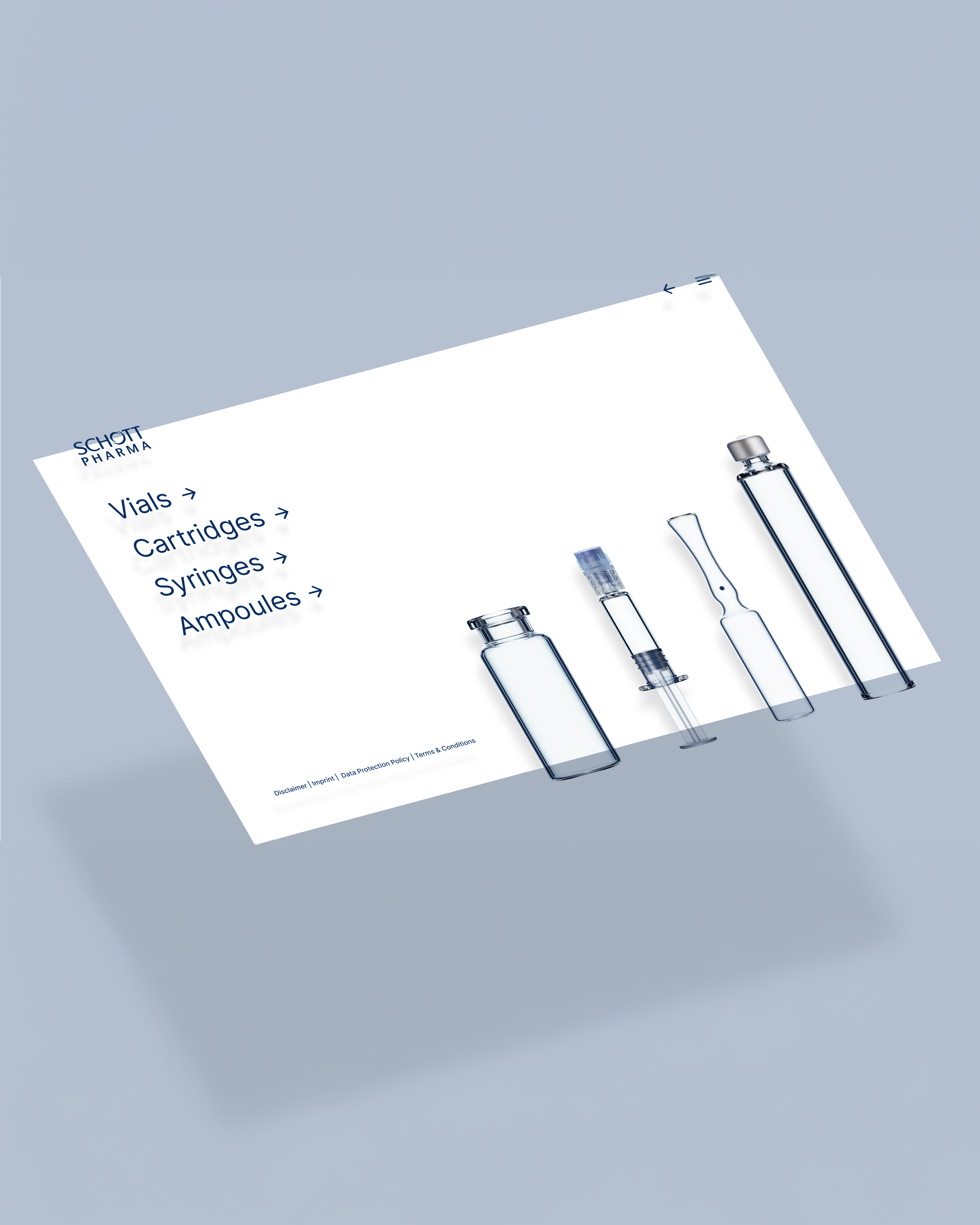
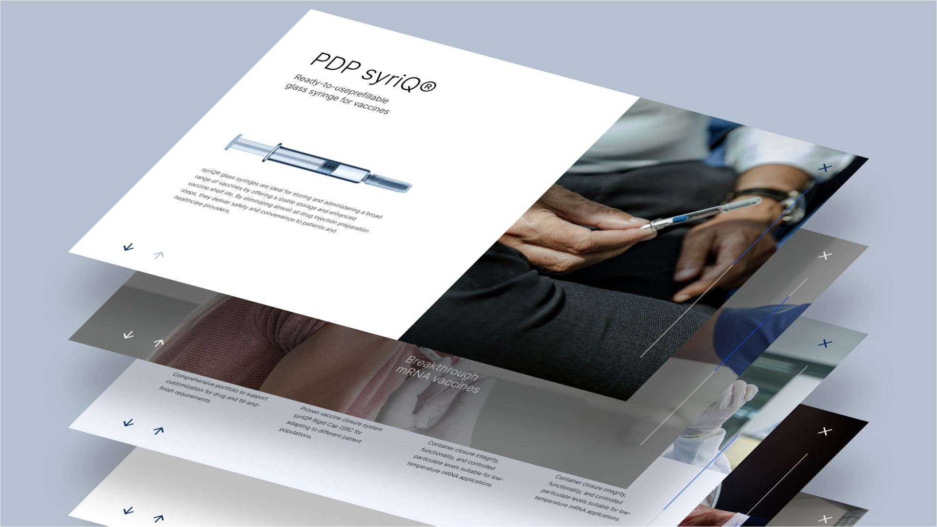
Smart Structure, Seamless Experience
The app was restructured into three key sections: SCHOTT’s core principles, its services, and the product portfolio—with the latter being the most critical. We placed special emphasis on making the portfolio easy to browse and compare, helping users understand product variations at a glance. To enhance usability, most content appears in pop-ups—so when closed, users return exactly to where they left off, keeping the experience smooth and anchored.